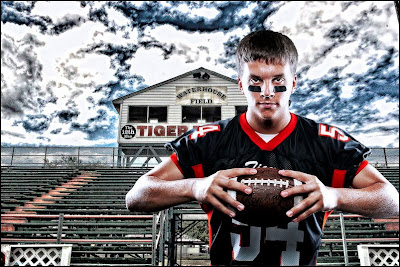
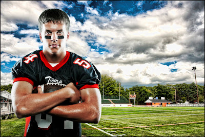
And to be honest, another motivator is that we think there is a market for this kind of work for high school athletes.
The first image has the more "dramatic" sky and folks that have already seen it either liked or disliked it because of the sky.
These are my very first attempts at this, so I have not perfected the technique, there are things I would like to to better.

 Both images are composites. I shot Andy in the studio and then waited for a day that was sunny with big puffy clouds before I shot the football field.
There were two important tools that I used for these shots:
1. The background images are HDR and I used the "Joel Grimes" lighting and processing techniques for both the images (the subject and HDR background). If you have not had the pleasure of going to one of his seminars not to worry, the same information he teaches at the seminars is also available on DVD. I am lucky to have both (gone to the seminar and the DVD), for the reason I harp on every time I review a DVD, you get to watch it over and over again to refresh your memory and there are a lot of steps that go into these images and there is no way I could do it from my seminar notes. I will say that the DVD is not a Cecil B. DeMille production, but it wasn't meant to be, but that doesn't change the amount and value of the content one bit.
2. I use Photoshop CS5 and though it does a much better job at cutting out a subject from the background (with the new and improved selection tool/refine edge), it still didn't "cut it" for me (slight pun intended). Thank goodness I had ReMask from Topaz Labs. ReMask is a Photoshop plugin that's quick, easy, AND does an outstanding job. Bottom line, these images might not have been possible (for me) without ReMask. To see how well and easy this works you can check out the tutorials here and take it for a free test run here.
Helpful hint, when we shot the studio images of Andy they were done on a white background and I think life would have been made a lot easier had we used an 18% grey background.
So, let me here you thoughts, what you like and don't like about these images and what could be done to make them better.
Clicking on either image will open them in a new and larger window.


